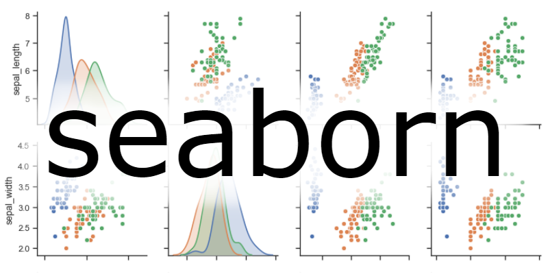
Tutorial of the seaborn python library in which we will review the data visualization functions offered, from graphs of univariate and bivariate distributions, to those that model and show simple linear models that allow us to discover trends and patterns in our data very easily. We will review the color palette management tools and how to customize our visualizations.
Content
- Presentation
- Seaborn functionality
- Figure and axis-level functions
- Datasets
- Distributions
- Relationships between quantitative variables
- Relations between quantitative and qualitative variables
- Statistical models
- Heat maps
- View size
- Colors
- Conclusion